One of the rooms we always avoid in our house is the laundry room. It was cluttered, full of way to much stuff, and had no practical storage system. We despise laundry anyways, so why would we spend time or money fixing it up? Until the pandemic hit. With nothing but time on our hands at home we decided to tackle the worst room in the house, on a budget. Here’s our DIY laundry room makeover we did in a weekend. Actually, my husband Bob did all the work, I just picked everything out and supervised #BobtheBuilder.
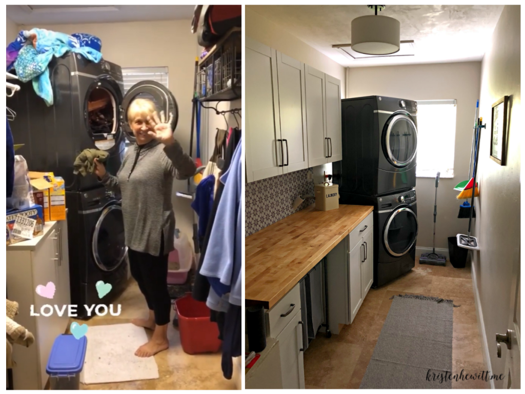
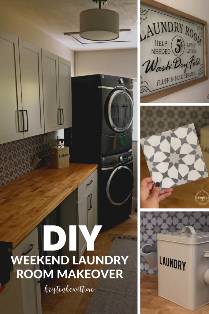
Here’s what the laundry room used to look like, and what it looks like now. (Please pardon the BEFORE image, I took a screen shot of an Instastory.) Big improvement huh?
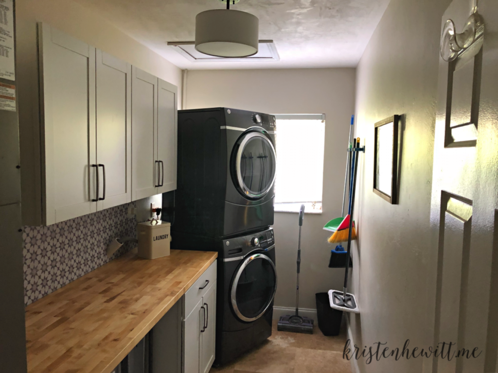
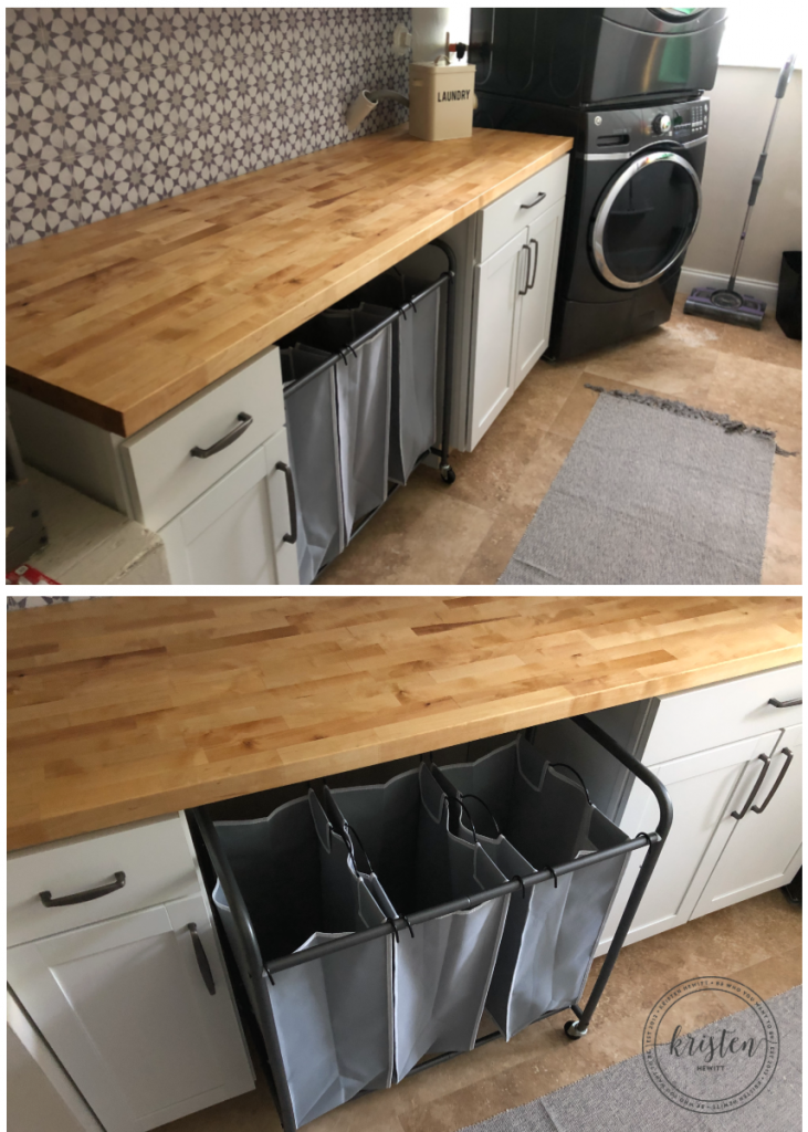
We priced out custom cabinets but didn’t want to spend a fortune, so we bought the pre-fabricated cabinets at Lowe’s and the butcher block counter top at Home Depot. We almost bought a laminate counter top from IKEA which would have been cheaper, but I loved the warmth the butcher block brings. I really wanted the cabinets to match our kitchen and bathroom quality, but it’s the laundry room! So to make it cohesive we used the same hardware as our kitchen cabinets.
We also added this drum light and rug from Amazon. Getting the same rug for my kitchen too!
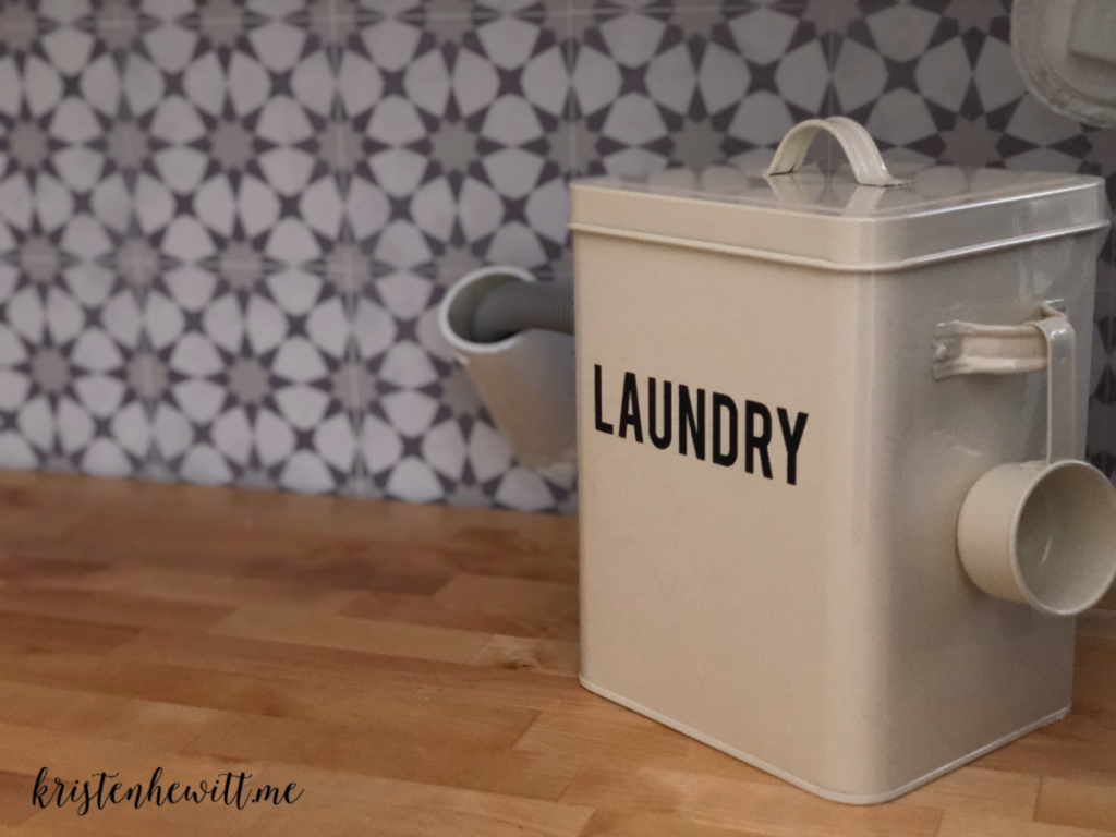
And this laundry container holds a ton of dry detergent. I need to accessorize more but my husband keeps telling me, “It’s a laundry room, WHO CARES?!” <insert eye roll> I might add a plant and an apothecary jar for missing socks!
I love how my husband was able to wrap the cabinets around this laundry sorter. It helps so much to have a designated place for the actual laundry instead of piles of clothes on the floor!
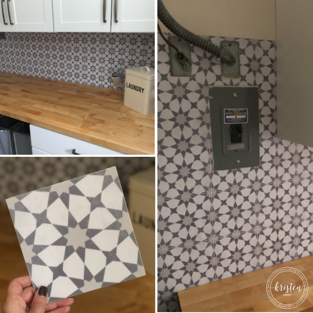
My favorite part of the room though is the tile backsplash. Except it’s not real tile…it’s stickers! We found so many options all over the web but I was obsessed with this neutral yet playful design from the Etsy shop Quadrostyle. They have so many great patterns, and comes in a strip like wallpaper or tiles you can actually put on tile. We chose the tile stickers because we had lots of cuts to do around hoses and switches.
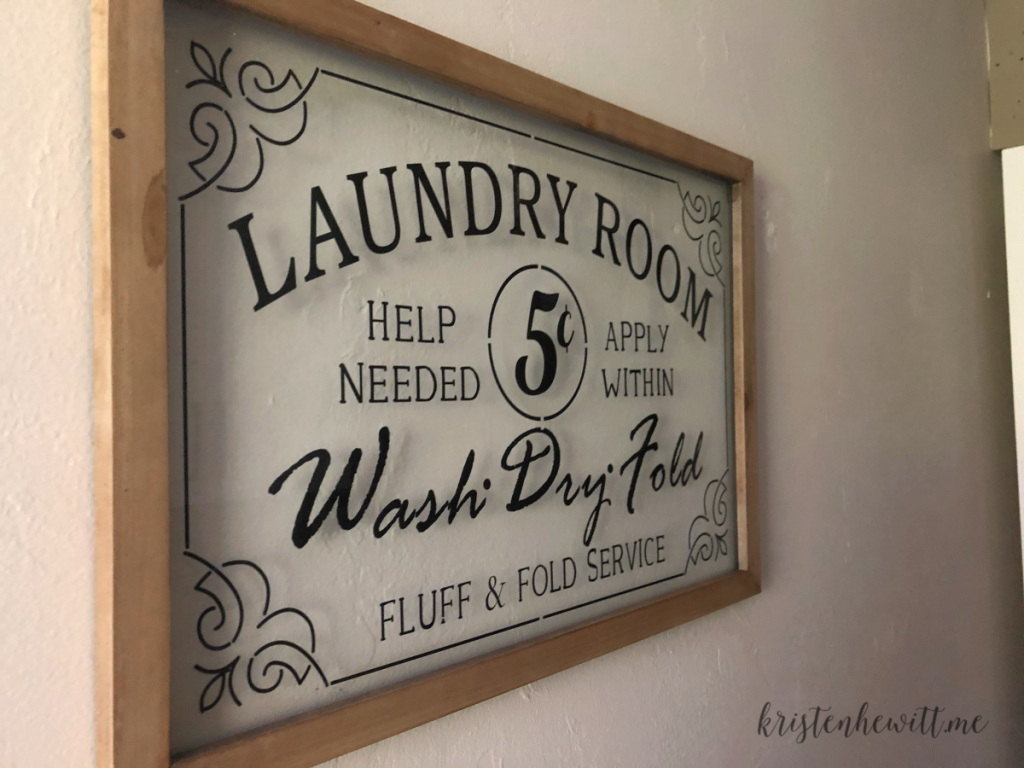
We talked about adding new paint to the walls but this pattern adds so much personality I don’t think we need it. This shade by the way is Elmira White from Benjamin Moore. We have tan travertine tile we can’t change because of the cost, and this paint shade is a greige, but leans more beige than grey. Here’s what the paint looks like behind this glass sign I found at Zulily.
I’m really happy with how neat and clean this room looks now and how much storage we have. We can fit all the pet food, paper towels, cleaning supplies, and extra snacks we need! And now we have a place to actually fold laundry. Stay tuned for a recap of my daughter’s new Harry Potter bedroom!
If you liked this post, you might like my free bathroom printables!
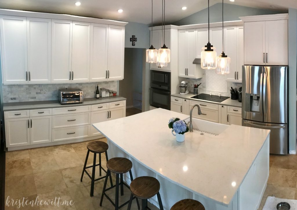
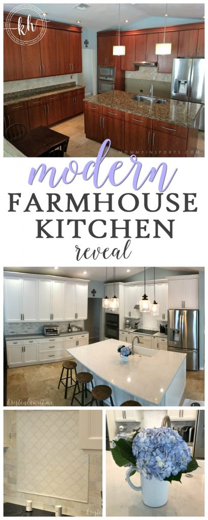
Or a recap of our kitchen makeover.



Wow. What a transformation. I love it! I want to do that exact same makeover at my house! Such beautiful colors and decor too!